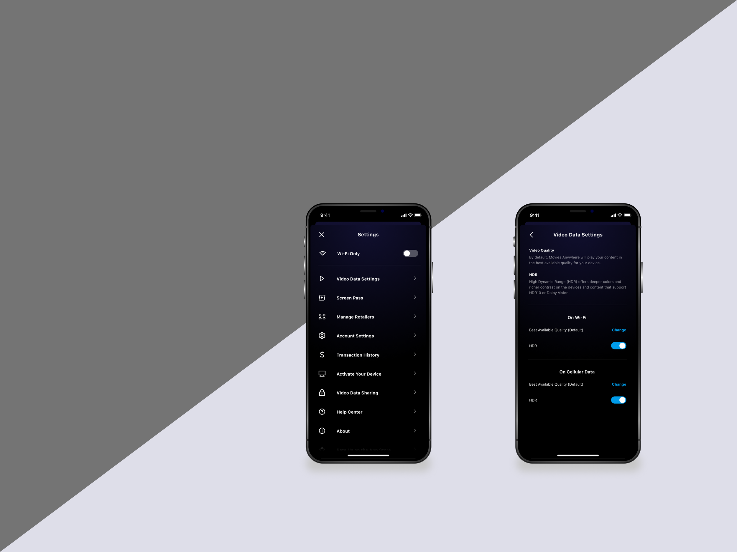
Research, Usability Testing
Video Playback Settings
To improve how users manage mobile video streaming preferences and data usage, our team explored new approaches to organizing Video Playback Settings. I conducted evaluative usability testing to understand how users interpreted different settings structures and identify opportunities to improve clarity, navigation, and confidence when managing playback preferences.
Mobile
Platform
Tools
UserTesting.com, InVision
Product Design & Product Teams
Collaboration
Context
As mobile video consumption increased, our team was revisiting Video Playback Settings to help users better manage data usage and streaming preferences. Existing settings and labels created uncertainty around what controlled video quality, when cellular data was used, and how different settings interacted with one another.
Before investing in implementation, the team wanted to validate two proposed information architectures for Video Playback Settings. We needed to understand how users interpreted the settings, whether they could successfully complete common tasks, and which structure best aligned with users' mental models.
I partnered with product and design teams to conduct an evaluative usability study comparing two concepts and identifying opportunities to improve clarity, navigation, and confidence when managing video playback preferences.
Research Questions
The study was designed to answer three questions:
How do users interpret and navigate different organizations of Video Playback Settings?
Which information architecture best aligns with users' mental models and expectations?
What labels, interactions, or content create confusion or reduce confidence when managing playback preferences?
Method
Study design
To gather early, directional feedback before implementation, I conducted an unmoderated usability study (via usertesting.com) with six mobile video users to evaluate two proposed information architectures for Video Playback Settings.
Participants completed realistic tasks involving video data usage and playback preferences, including locating settings, configuring cellular data options, and adjusting video quality. Each participant evaluated both concepts using an AB/BA counterbalanced design, enabling us to compare the two information architectures while minimizing bias introduced by presentation order.
Participants
6 participants
Mobile video streaming users
Activities
Participants completed tasks such as:
Locate settings related to video data usage
Configure playback preferences for cellular data
Adjust video quality settings for specific scenarios

“When the toggle is on the main page, you are wondering to yourself, is it affecting any of those other sections, or is it just affecting the video data settings."
— Participant

Results
Abridged and modified for confidentiality

Users expected related video settings to be grouped together.
"I think when you bundle everything together, it makes it a whole lot easier for you to adjust your settings as you do it." - Participant
All 6 users voiced preference for the grouped toggle version.
Why it matters: Distributed controls increased navigation effort and reduced confidence.
Recommendation: Consolidate related settings into a single section.

Participants struggled to understand what certain settings controlled because labels relied on system terminology that did not match users' expectations.
"That would take a little looking for me, cause I would think [the Wi-Fi Only toggle] would be in ‘Account Settings’." - Participant
Why it matters: Unclear labels increased cognitive effort and introduced uncertainty about the consequences of changing settings.
Recommendation: Revise labels to use clearer, user-centered language that better communicates purpose and outcomes.

Participants interpreted disappearing sections as features being disabled or removed rather than intentionally hidden.
When tasked with allowing data use with HDR off, Participant was confused after navigating into “Video Data Settings” because Wi-Fi Only had not been toggled off. "Well this has only Wi-Fi." - Participant
Why it mattered: Progressive disclosure unintentionally reduced trust and confidence in the experience. Users spent additional effort validating their actions instead of progressing through their tasks.
Recommendation: Maintain visibility of related settings and provide clearer cues when content changes dynamically.
Limitations and Future Considerations
Given additional time, I would conduct a follow-up evaluation of revised labels and grouping strategies to validate whether these changes improve comprehension and reduce uncertainty.